|
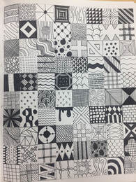
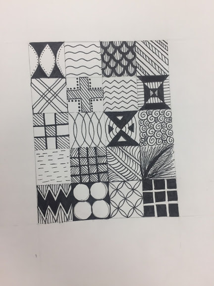
4. Two mini lessons that were very beneficial were the 100 squares and the candy drawing. The 100 squares helped me think of fun patterns, and also made me realize how important it is to be neat. I found this assignment to be kind of tedious, but I was very happy with the outcome. I don't believe I needed more instruction for success because it was a very straightforward assignment. It was very helpful having the examples. For the candy drawing, I chose to use chalk pastel pencils. Working with the chalk was hard because the more I blended the more washed out the colors became, and I had to figure out how to deal and fix that. It made me appreciate the application of colors, and how to blend the colors to make other colors or tints/shades. I don't believe there could have been more instruction, but it was a big help when Ms. Rossi helped me with shadows and reflection lines. This ensured success in the piece.
|
|
|
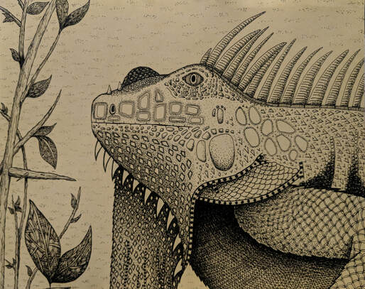
5. One classmate in my class created a piece for the pen&ink project. I think she really captured the essence of the project and executed it perfectly. Paige created an iguana with a variety of textures creating values. She shows exemplary craftsmanship, and makes it look very realistic. She used stippling and hatching to create the values in her patterns, and made her patterns more dense or less dense where needed. She also wrapped the pattern around the form to make it look realistic. She also used textures that you would see on an iguana, such as dry and scaly. She didn't have anything directly in the middle, so the composition is successful. Your eye goes immediately to the iguana because she has a simple and light background. I think this successfully depicts the assignment.
|
|
|
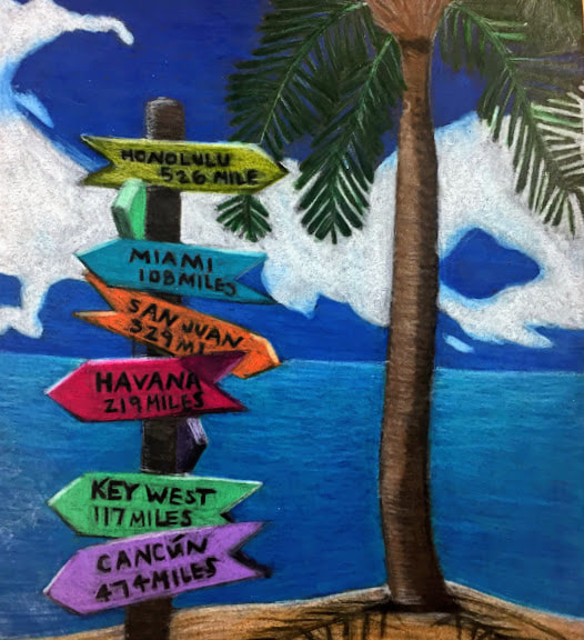
6. My favorite medium to work with was the prisma colored pencils. My final piece for this assignment was my favorite out of all the things I did this year. I really liked being able to layer the colors and blend them out. I found I could be a lot more detailed and realistic with the colored pencils. I also like how vibrant they are, and how the color doesn't fade with the more you blend. Layering the colors was something I was able to master to create different tints and shades, like for the water to create the reflection in the water. All of the practice was very helpful with mastering this skill. Being able to blend the colors into one another was difficult, but I was able to master it with practice.
|
|
|
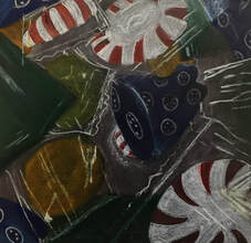
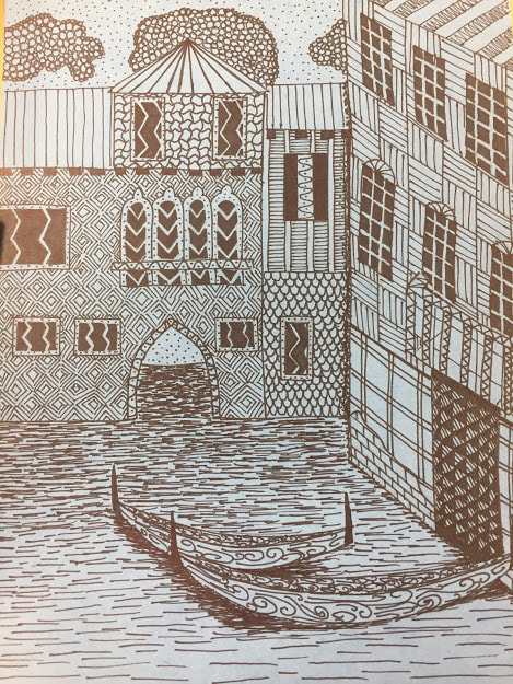
7. I felt I was least successful in the pen and ink drawing. I really don't like that piece. I think it looks very childish, like a kindergartner could have done it. I think I needed more intricate and detailed patterns. I also think I could have mapped the patterns differently to create more values. I didn't have enough value in my drawing and it looked very one-dimensional. If I were to change it, I would start with picking better patterns and making it more detailed. I would also spend more time on it to make it better craftsmanship wise. I don't think it reflects what I can do as an artist.
|
|
